Data source used for this post is the ‘Internet Sales’ data mart of the ‘AdventureWorksDW2017´ SQL server database.
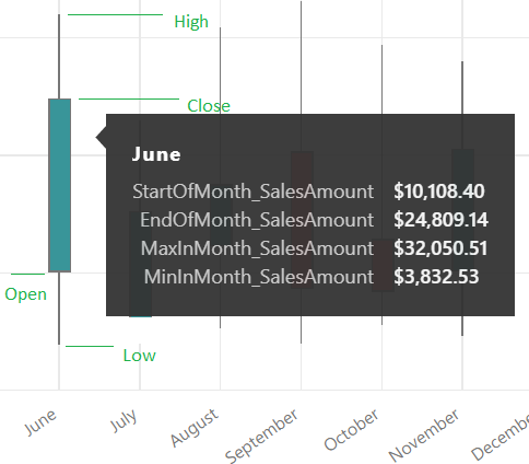
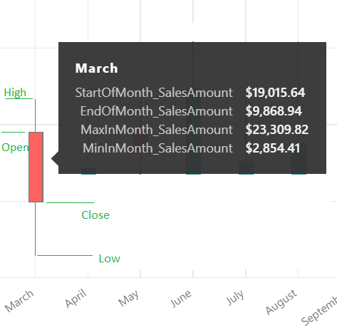
A Candlestick graph requires four values, namely Open-Close-Low-High for each time period that is being compared. For this demonstration, will look at creating the Candlestick visualization that compares a calendar year month-on-month sales on the first day of the month Sales(Open), last day of the month Sales(Close), least sales on a day in the month (Low) and the highest Sales on a day in the month(High).
Let’s look at the steps involved in doing this.
1) Create four measures in the fact table in the data model using the DAX formulas below that could potentially get us the Open-Close-Low-High values in a month.
DAX formula for the first day of the month Sales (Open):
StartOfMonth_SalesAmount =
 CALCULATE
 (
     SUM('Internet Sales'[SalesAmount])
   , STARTOFMONTH(DateDimension[Date])
 )
DAX formula for the last day of the month Sales (Close):
EndOfMonth_SalesAmount =
 CALCULATE
 (
      SUM('Internet Sales'[SalesAmount])
    , ENDOFMONTH(DateDimension[Date])
 )
DAX formula for the least sales on a day in the month (Low):
MinInMonth_SalesAmount =
 MINX
 (
     SUMMARIZE
         ('Internet Sales'
           , DateDimension[Date]
           , "Sales Amount per day"
           , SUM('Internet  Sales'[SalesAmount])
          )
     , [Sales Amount per day]
 )
DAX formula for the highest Sales on a day in the month (High):
MaxInMonth_SalesAmount =
 MAXX
 (
     SUMMARIZE
         ('Internet Sales'
           , DateDimension[Date]
           , "Sales Amount per day"
           , SUM('Internet Sales'[SalesAmount])
          )
     , [Sales Amount per day]
 )
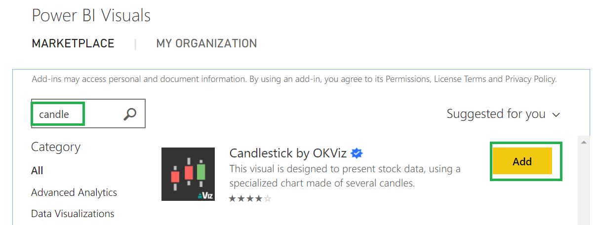
2) Import the Candlestick visualization from the marketplace, for more information check the below screenshots. Please note that you should have loggedin to retrieve the visualization from the marketplace.

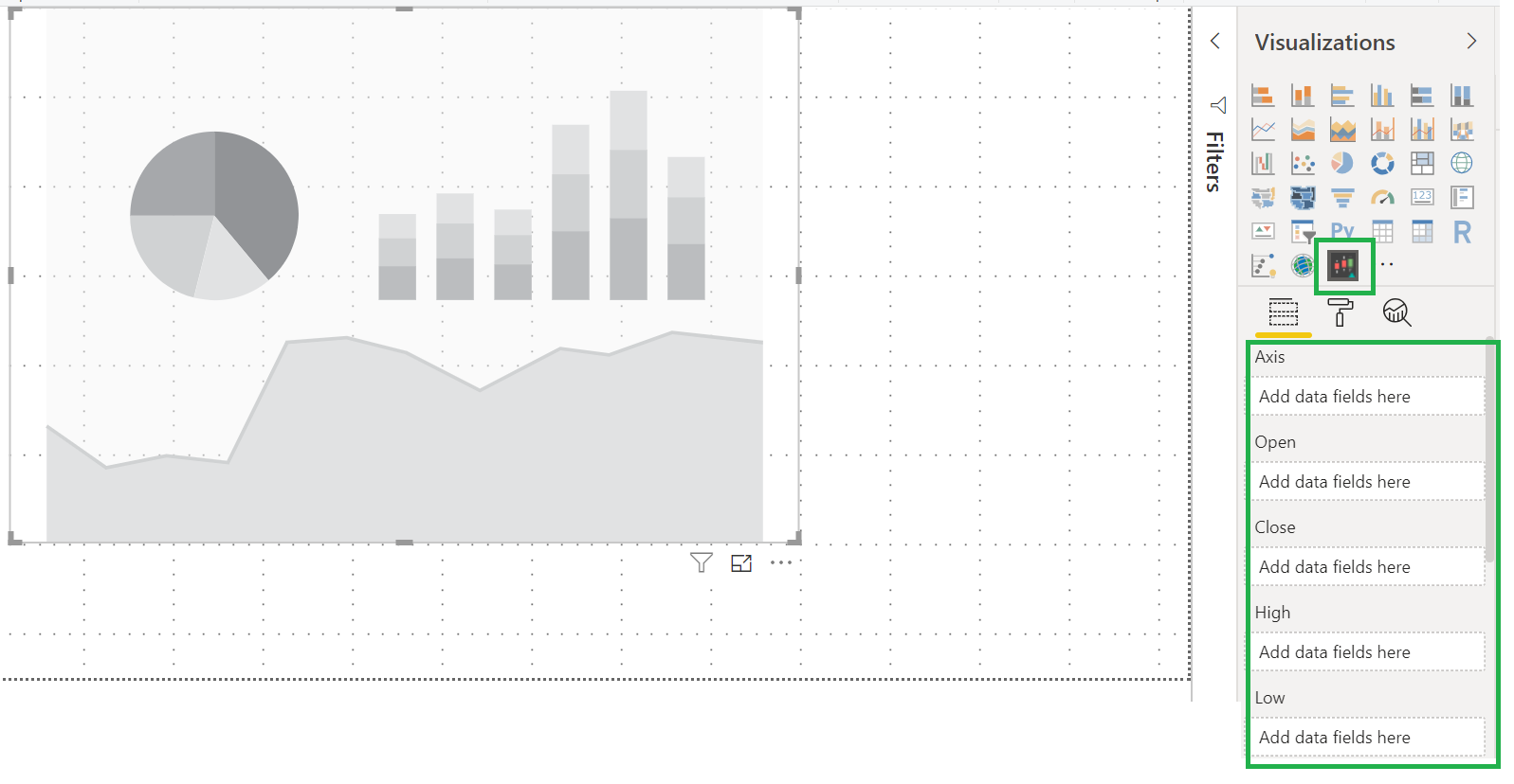
3) After the above step, Candlestick visualization is added to the list of visualizations. Click on it to add the visualization to the report canvas. Now you could see the Visualization has the Axis, Open, Close, High, Low and Trend Lines fields under the Fields section.
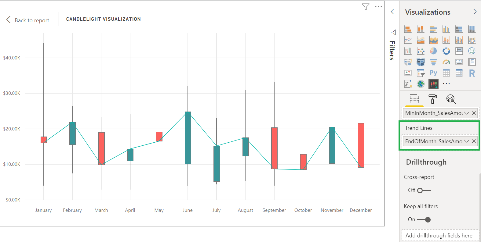
4) Now, drag and drop then newly created DAX formulas StartOfMonth_SalesAmount, EndOfMonth_SalesAmount , MaxInMonth_SalesAmount and MinInMonth_SalesAmount into Open, Close, High and Low fields respectively. Add ‘Month Name’ from the Date dimension into the Axis field. In addition to that, add the ‘Calendar Year’ into the ‘Filters’ section and select the filter to use 2012 year. Now the Candlestick visualization looks as below.
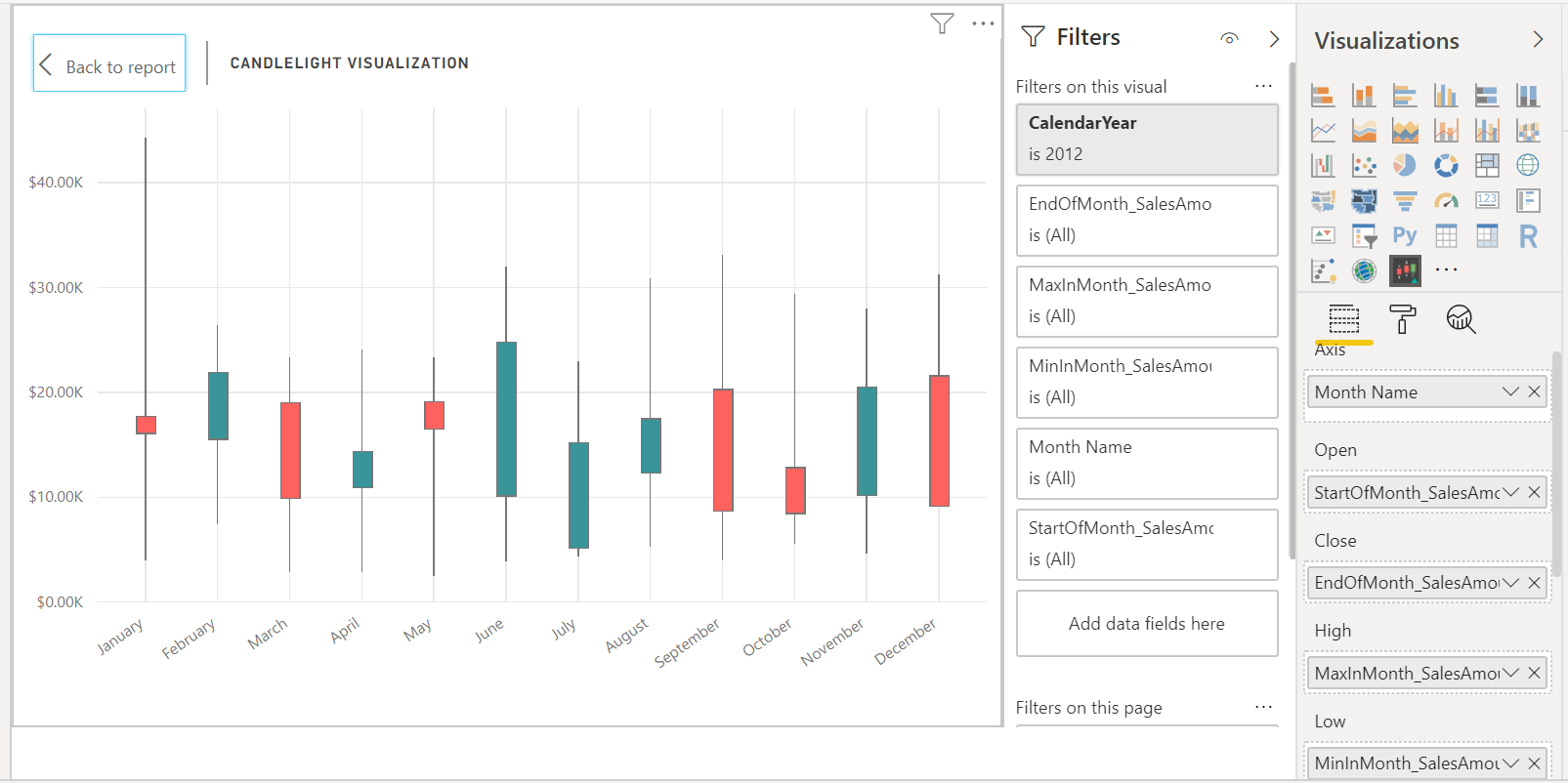
Green bar in the candlelight visualization resembles ‘Bullish’ pattern, where the sales in the end of the month is higher than the beginning of the month together with the lowest sales and highest sales in the month.
Red bar in the candlelight visualization resembles ‘Bearish’ pattern, where the sales in the end of the month is lesser than the beginning of the month together with the lowest sales and highest sales in the month.
7) Adding one or more of the values into ‘Trend Lines’ in the Fields section would add the trend line into the visualization.
Now you are good to go to use the Candlestick visualization in your Power BI report. Hope this post will help you.
