Data source used for this post is the ‘Internet Sales’ data mart of the ‘AdventureWorksDW2017´ SQL server database.
This post will discuss on the five most common methods to filter the Power BI visualization.
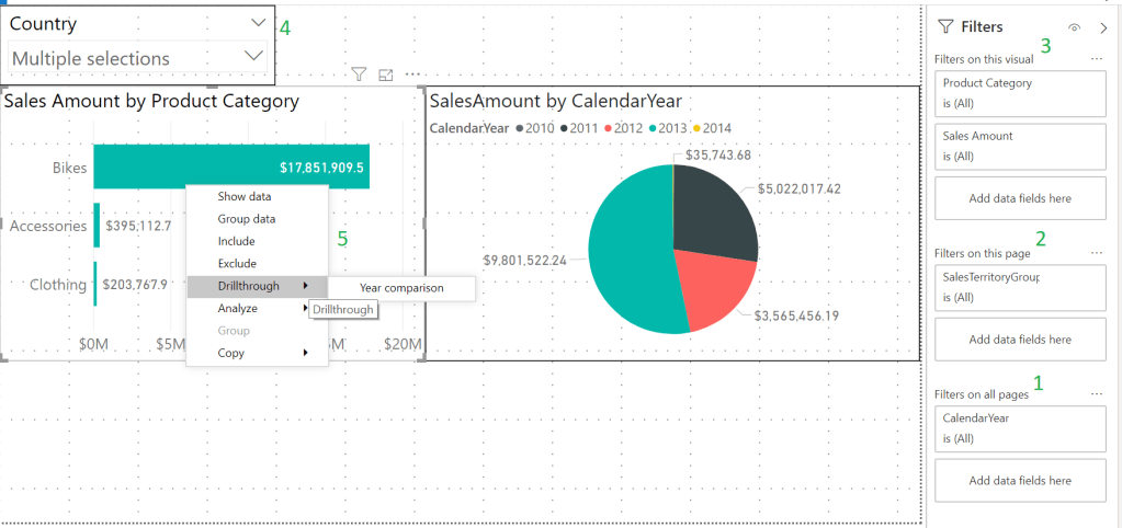
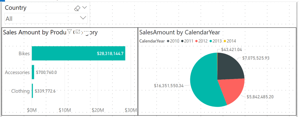
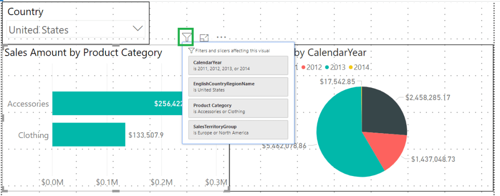
For the demonstration, I have created one bar chart which displays Sales Amount by Product Category, one pie chart which is distributed according to the Sales Amount per Calendar Year and one Slicer visualization on Country.
Before we look into the most common filtering methods, enable the ‘Filters’ pane on your Power BI report. To do this on the Power BI desktop, select File -> Options and settings -> Options. A new dialog box ‘Options’ will open. In that dialog box, select ‘Reporting Settings’, and then under ‘Filtering experience’, enable ‘Enable the updated filter pane, and show filters in the visual header for this report’.

Now you see a new ‘Filters’ pane added to your report. Drag in ‘Sales Territory Group’ into ‘Filters on this page’ section and ‘Calendar Year’ into ‘Filters on all pages’ section.

Let’s look at filtering the bar chart in the report using 5 different filtering methods.
1) Report level filter (‘Filter on all pages’ in the ‘Filters’ pane): Data filtered using this filter will affect all the visualizations on all the pages of the report. Modify the ‘Calendar Year’ filter to show only the calendar year data between 2011 and 2014.

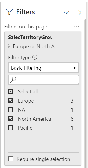
2) Page level filter (‘Filter on this page’ in the ‘Filters’ pane): Data filtered using this filter will affect all the visualizations in the current page of the report. Modify the ‘Sales Territory Group’ filter to show only the ‘Europe’, ‘North America’ and ‘Pacific’ Sales Territories.
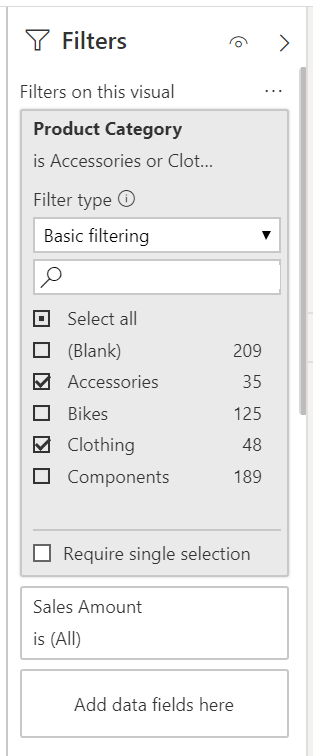
3) Visual filter (‘Filter on this visual’ in the ‘Filters’ pane): Data filtered using this filter will affect only the visualizations selected in the report canvas. Select the bar chart to enable the ‘Filter on this visual’ in the ‘Filters’ pane. Modify the ‘Product Category’ filter to show only the ‘Accessories’ and ‘Clothing’ categories.
4) Filtering using Slicer visualization: Data on other visualization can be filtered using the ‘Slicer’ filter directly. Modify the ‘Country’ slicer to show only the ‘United States’ data.

5) Drillthrough filter: Drill through filter lets you filter a single entity of the visualization to check its corresponding data. More on this explained ins separate post. Click on this link to learn about Drillthrough filter.
To check the filters and slicers affecting your visualization, select the visualization and then click on the filter icon of the visualization.
Hope this helps!
